Happy New Year and welcome to the second annual installment of the unofficial Global Alarm Bell Index (GAB Index). I know you’ve all been desperately waiting to see if the GAB Index increased in 2013, so let’s get started.
Global Temperatures: 3 Alarm Bells
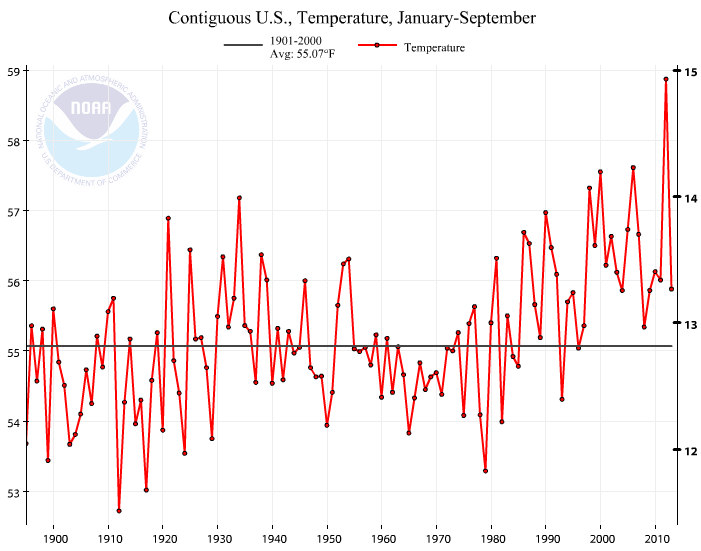
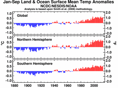
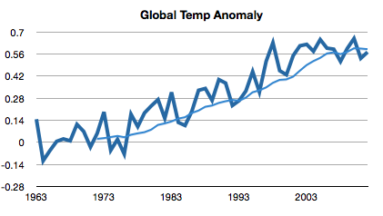
NOAA says 2013 was the fourth-warmest year on record, and the hottest since 2010. Nine of the warmest ten years on record have occurred since 2000. Etc, etc. What they don’t say is that all of those warm years have been measuring within such a narrow range that the increase in temperatures has all but stopped – the decade 2004-2013 was only 0.1 degree Celsius warmer than the decade before it. This is the lowest decade-to-decade increase since 1982, and barring a ridiculously record hot year next year, the decadal increase will drop safely below 0.1 degree / decade in 2014.
It’s going to take a lot more than the pace of the last 15 or so years to hit the predicted 2-6 degrees of warming by the end of the century; we’re barely on pace for 1 degree right now, and even scientific journals like Nature are starting to publish acknowledgements of the pause and trying to explain why their earlier models didn’t predict it. Some say the heat is all hiding in the ocean and will be reflected in the surface temperature data any time now, but until that appeal to the future actually happens, I’m arbitrarily dropping the alarm bells from 4 to 3.
Arctic Sea Ice: 8 Alarm Bells
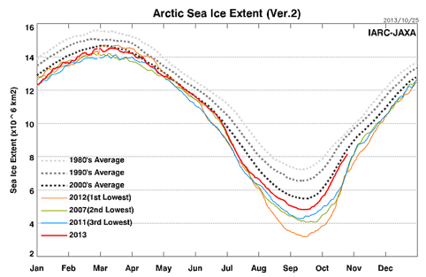
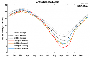
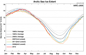
After a very alarming record low in 2012, the arctic sea ice made a remarkable recovery in 2013, leaping back to only the 7th worst minimum ever with record increases in both percentage and absolute terms. This provides at least some assurance that things can get better more quickly than we previously thought. Some are quick to claim this as a complete recovery, but the records were only possible because the previous values were so low, and the overall trend is still markedly downward. So I’m only going to arbitrarily dial back the Alarm Bells here from 10 to 8.
Antarctic Sea Ice: 0 Alarm Bells
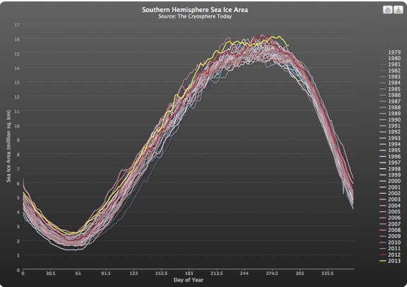
The other side of the globe continues to paint a different picture. 2013 Antarctic sea ice remained above average for the entire year, reaching the second-highest minimum on record and the third-highest maximum on record. Meanwhile, the top five maximums and top six minimums in the 35-year record have all come since 2000, pointing to an continuing increase in ice.
Claims that the ice is thinning and will start to show up in the surface data remain an appeal to the future. There are also claims the the land ice is really what matters because it is melting and contributing to sea level rise, but as we shall see below, that’s not an increasing concern yet, either. I’m going to have to stick with 0 Alarm Bells for the second year in a row.
Atlantic Hurricanes: 0 Alarm Bells
Despite early predictions of an active season with 7-11 hurricanes and 3-6 major ones, the 2013 Atlantic Hurricane season was a complete dud, with 0 major (Category 3+) hurricanes for the first time since 1994 and the fewest total hurricanes (2) for the first time since 1982.
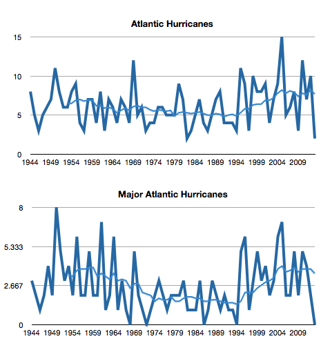 This makes the 10-year moving average of major hurricanes the lowest since 2003, hinting that we may be coming off a peak that looks remarkably similar to a sinusoidal peak from the 1950’s. The record year of 2005 (Katrina, et. al.) is increasingly looking like an outlier and not a new normal; in fact, the United States has not had any major hurricanes hit landfall since that season, a “drought” that is its own record. If activity picks up instead of continuing to decline we will raise the alarm bells again, but for now I am arbitrarily dropping them to 0.
Pacific Hurricanes: 3 Alarm Bells
In my efforts to include as much data as possible (and do as little cherry-picking as possible), I have decided to add Pacific ocean activity to my snapshot, especially since it is much larger than the Atlantic Ocean. It’s also much more complicated – I’m still getting used to the hurricanes, cyclones, and typhoons and how to understand all the trends therein.
I can tell you that the 9 hurricanes and 1 major hurricane of the 2013 Pacific season were respectively average and below average for the area and well below the record 1992 year. Furthermore, the six strongest Pacific seasons are all from 1992 and earlier, suggesting things are not getting worse.
But apparently that’s just the eastern Pacific. The western Pacific typhoon season spawned an above-average 13 typhoons with 5 “super” typhoons. In particular, Hayian/Yolanda devastated the Philippines and apparently was the strongest storm ever to strike land and may have the strongest wind speeds ever recorded. So that’s something. I’m still looking for good historical data on year-by-year seasonal activity.
So, in summary, the Eastern Pacific was weak but the Western Pacific was strong and involved a record-breaking storm, which I think arbitrarily warrants like three alarm bells.
US Tornadoes: 0 Alarm Bells
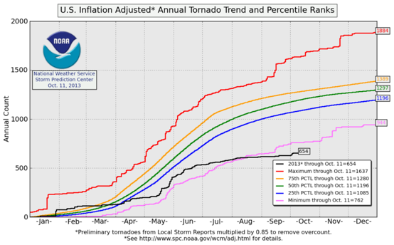
The 2013 tornado season was a dud, with perhaps the fewest tornadoes on record in the United States. There were only 28 F3+ tornadoes, which will add to the trendless major tornado graph below once the NCDC adds another little blue line on the end that will be very similar to 2012’s:
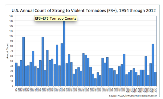 There was a notable tornado that struck Oklahoma, apparently being the widest ever reported, but since the data is not as extensive on that I don’t think it warrants any alarm bells. I am going to arbitrarily assign 0 alarm bells for tornadoes for a second year in a row.
Sea Level Rise: 2 Alarm Bells
My source for sea level data has only updated through the first nine months of 2013, where they have the sea averaging about 2.63mm higher than 2012. The Colorado site still says the same average long-term rise of 3.2mm/year that it said a year ago, which is still a pace of far less than half a meter by the end of the century (in other words, not that scary).
But that’s assuming the increase stays constant. Of course, it could accelerate, but if anything it’s actually decelerating. The data’s not long enough to do much with 10-year moving averages, but the decade ending in 2013 only averaged a rise of 3.13mm/yr which is slightly less than the 3.26mm/yr for the decade ending in 2003. The last five years also had a lower increase in average from the previous five years than the two previous five-year periods.
OK, enough with the arbitrary data crunching. The point is that the measured sea level is rising, but very slowly and definitely not accelerating anywhere near fast enough to reach terrifying predicted levels. So I’m going to keep the modest 2 alarm bells from sea level rise for a second consecutive year. If the deceleration becomes more pronounced next year, I may drop it lower.
US Drought: 3 Alarm Bells
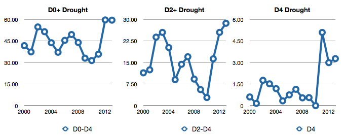
Drought in 2013 wasn’t quite as bad in the US as 2012, but over half the country was considered to be in some level of drought for almost the entire year, according to the Drought Monitor. Depending on which level of droughtness you look at, the metric either went up or down a bit, but still pretty elevated compared to the rest of this century so far.
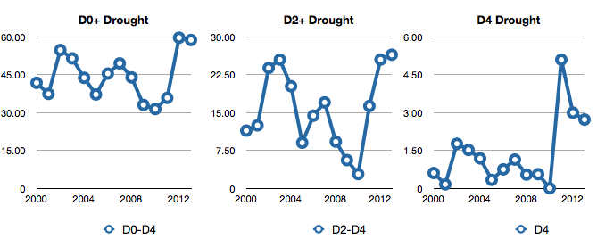 I decided that my arbitrary Drought Point Index was double-counting extreme levels of drought, so I arbitrarily re-jiggered it and come up with 139 Drought Points for 2013, which is slightly lower than the 141 Drought Points from 2012, but the last two years are still easily the two highest values in the (short) 13 year history.
That’s the most quantifiable data I can find. However, NCDC has their own Palmer drought indexes here, and they all look something like this…. a.k.a. no trend at all and definitely no drought as bad as the 1930’s:
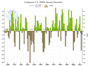 Actually these Palmer indexes don’t even make the last two years look as bad as 2000-2002, much less the 30’s or even 50’s. So even though I like my Drought Monitor stats because they precisely assign four levels of drought across the whole country to percentages of two decimal places each, I’m gonna have to place more emphasis on these longer-term data points which do not indicate any long-term increase in drought; we had a really bad PHDI score in 2012 but it didn’t stay bad two years in a row. So I’m gonna arbitrarily drop the drought alarm bells from 5 to 3 this year while continuing to not weight them very highly in my arbitrary Global Alarm Bell index.
Total Adjusted 2013 GAB Index: 2.61 Alarm Bells
Global temperatures are pausing; sea level rise is decelerating; Antarctic sea ice is still growing; hurricanes and tornadoes and drought still aren’t increasing. The only thing that’s still really bad is Arctic sea ice but even that’s not as far gone as we thought.
So after carefully feeding these arbitrary values into my arbitrary Alarm Bell Weighting Algorithm, I have calculated a Total Adjusted 2013 Global Alarm Bell Index of 2.61 Alarm Bells, which you will notice is a remarkable decrease from the 2012 GAB Index of 3.46, giving us a Global Alarm Bell Anomaly of -0.85 Alarm Bells! To help you properly adjust your concern level, let me reprint my handy dandy Alarm Bell Response Chart:
I guess you all did such a good job planting trees last year that all you need to do this year is double-check on that ocean to make sure your house can handle a storm surge that might be 2.5mm higher than last year’s.
Thanks again for reading this far. We’ll re-visit the State of the Planet in about a year and see how those alarm bells are ringing.


You must be logged in to post a comment.